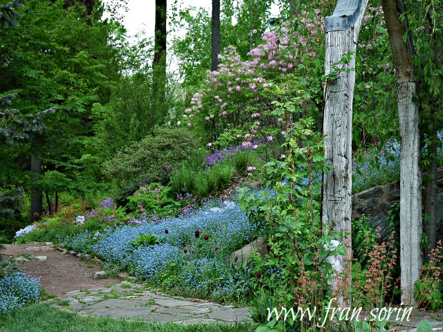

There are several elements that make up a well thought out landscape: they include structure, shape, texture, scent, and movement. But for the majority of us home gardeners, the first element we take into consideration when designing our own personal paradise is color.
Thanks to renowned garden authors like Penelope Hobhouse, who wrote Color In Your Garden, Rosemary Verey, author of Making of A Garden, and Christopher Lloyd’s Gardening Year, (just to name a few), I became enthralled with color in the garden when I first became a passionate gardener in the late 80s. Although I had worked with design and colors for several years in other arenas, learning how to use it effectively in the landscape was something all together different.
Below are 12 Tips About Color Design that I’ve learned over the years.
1. Color is one of the easiest ways of setting a tone and expressing your personality in the garden.
2. Before buying, hold plants up against each other at nursery, lay pots out on the ground prior to planting, do the exercise from my book, Digging Deep, called Playing with Flowers, or pick up a slew of paint swatches from a paint store and experiment with different combinations at home.
3. Know the basic principles of color design.
Primary Colors are red, yellow, and blue
Secondary Colors are created by mixing two primary colors together: orange (red and yellow), green (yellow and blue) and purple (red and blue)
Intermediate or Tertiary Colors are colors that are created by mixing a primary and a secondary color, for example, blue-green
Neutral Colors – black, white, and brown
4. Warm vs. Cool Colors
Bright colors (reds, oranges, and yellows) jump out at you and look best when used in a sunny location.
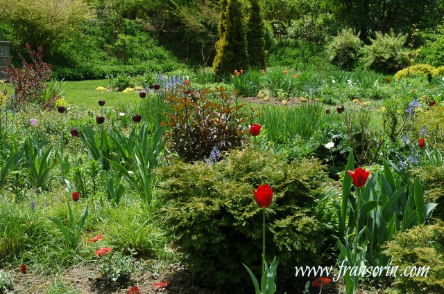 Photo above: a smattering of dark and bright colored tulips at Tennis Court Garden at Chanticleer in Wayne, Pa.
Cool colors (blues, purples, and greens) recede into the background and are most effective when used in a partially shady location or in a climate that experiences a lot of grey skies.
Pale colors, yellows, and whites reflect light and brighten shady spots.
Cool colors and pale shades create a sense of depth in the garden while bright colors make a garden look closer.
Pastels fade in bright sunlight while very warm colors sizzle and come alive.
5. Red infuses a garden with excitement and excitement. Unless creating a ‘hot’ cottage garden, use it sparingly.
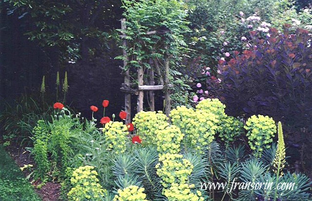 Photo Above: Euphorbia characias subsp. wulfenii, Cotinus coggygria ‘Royal Purple’ and red poppies in Sorin Garden, Bryn Mawr, Pa.
6. Keep in mind that, like musical notes, how colors are perceived change depending on the context in which they are used.
A color’s intensity will decrease when placed next to a complementary color but will increase when planted next to a contrasting color.
7. When designing a garden, use the same color repeatedly throughout the border to create a cohesive tapestry.
8. Use dark colors sparingly on a light background to create a powerful combination. The opposite is also true: By using a smattering of light colors on a dark background, the intensity of the design will be heightened.
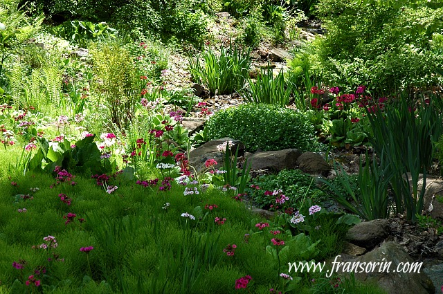 Photo Above: Primula Japonica at Chanticleer Gardens
9. Remember that your color palette changes throughout the season. Be mindful of what plants bloom at the same time to make sure that they work well together.
10. The colors of leaves can make as powerful of a statement as flower blossoms. Include them in the equation when you are deciding what to plant where.
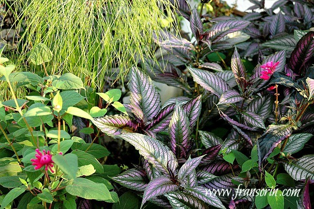 Photo above: Strobilanthes dyerianus (Persian shield), pink salvia, and carex sp. in Sorin Garden, Bryn Mawr, Pa.
11. Don’t think of green as a boring color. You can create an outstanding composition by using silver, light, dark, deep, and chartreuse leaved plants. Keep in mind that the texture of the foliage of the plants has an effect on the design.
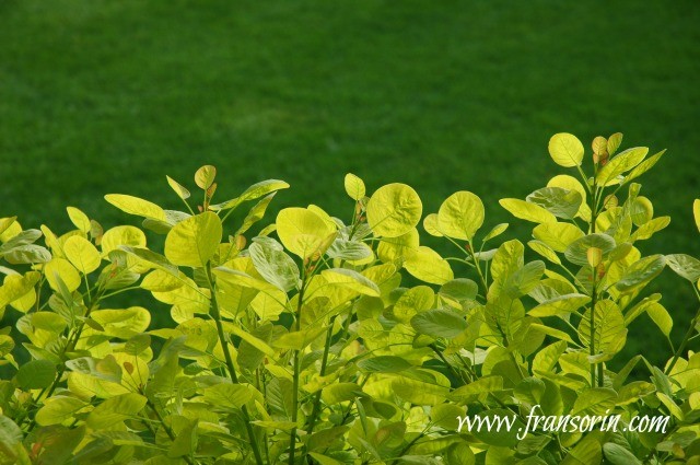 *Photo above: Cotinus coggygria ‘Ancot’ GOLDEN SPIRIT creates a magnificent contrast against the grass.
12. Discard what the doyennes of taste or experts advise when deciding how much and what colors to use in your garden. Follow your instincts and create a color palette that pleases your eye!
Now it’s your turn! Share a color combination that you’ve used in your garden and love.
Please note: A source for some of the information for the above article is from NYBG’S Color Theory In The Garden.